Problems solved
Explore how designs have been brought to life, with testimonials showcasing their business impact
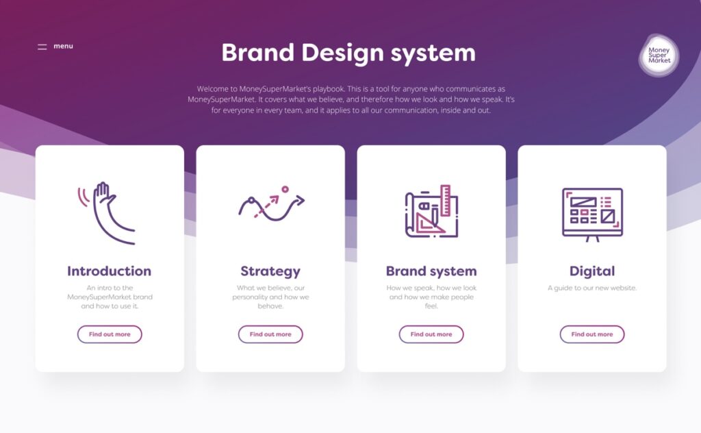
A super design system
Design system
IA
Product strategy
The problem
- A new brand identity featuring ‘MoneySuperSeven’ needed to be applied to the website and the design system
- Slow and resource intensive maintenance of the design system
The solution
- Design system update with the new branding/UI/documentation
- Design system replatforming & integration with site codebase
Project details
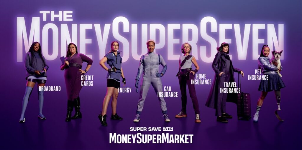
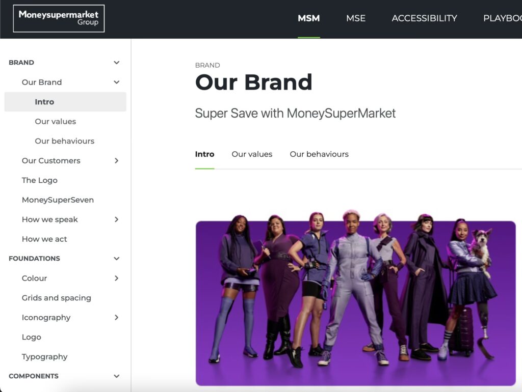
In September 2021, it was time for a brand refresh for MoneySuperMarket again, transitioning from its ‘Money Calm’ campaign to ‘MoneySuperSeven’.
MoneySuperSeven
This bold new campaign introduced a team of seven money-saving specialists, each representing a specific area of price-comparison: car insurance, energy, home insurance, broadband, travel insurance, credit cards, and pet insurance. This approach was designed to demonstrate the company’s comprehensive offerings and encourage consumers to explore multiple avenues for savings.


The campaign received positive attention for its creative approach and clear messaging, effectively communicating the brand’s expanded focus and dedication to customer savings.
However, some significant challenges were on the horizon when the new branding had to be updated on MoneySuperMarket’s website and design system.
Challenges with the design system
While the creative and UX teams were busy on crafting and validating the new brand identity, an issue arose with the existing design system. Things had gotten a bit out of hand. Updates and new components became increasingly lagging behind. With the big overhaul coming up, there was a serious risk, that it will make things even worse.
As the new branding was planned to be introduced soon, the teams prioritized doing the actual work first – designing, validating, and implementing the new branding. Updating the design system and documentation simply didn’t get enough resources, which ultimately killed the design system’s primary purpose – being the one source of truth.
MoneySupermarket needed to rethink its approach to design system to keep utilizing its benefits. There were many positive aspects to continue building upon, but there were undoubtedly areas that needed improvement.
The Good
Atomic structure
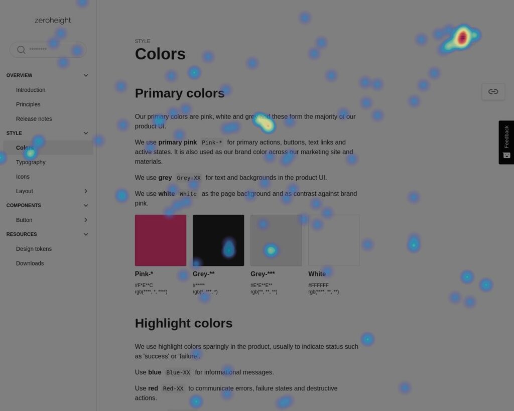
The good news was that a solid foundation was already established. MoneySupermarket already had a well-structured atomic design system. A rich component library – designed in Figma – was already in place, featuring foundations, components, patterns, and page designs.
The current system prioritized accessibility and inclusive design principles.
The frontend code of the components and foundations were developed and maintained in Storybook, which gave us a ton of flexibility to integrate with different systems.
The Bad
Design system CMS
On the flip-side, the existing design system presented significant challenges in terms of flexibility, required a lot of effort to update, and lacked automation. It was a joint effort from the entire design team to set up the first version of the design system, but unfortunately it still demanded a lot of resource to maintain it – mainly its CMS.
While the concept was sound, the need for manual maintenance and the lack of integration with existing design software (Figma, Storybook) led to its rapid obsolescence. It was no longer the single source of truth for documentation. Teams didn’t use it as collaboration tool between design and development teams – as it was intended to.
It became an impossible chore to keep up-to-date. It was evident that the design system CMS was the primary source of most of the issues.
The Solution
Zeroheight comes to the rescue
To enhance our design workflow, we have decided to replace our custom CMS with a more flexible solution. The team identified the following requirements against the new CMS:
- Automation & integration with Figma and Storybook is a must
There is simply no resource to do this task manually - Reduced maintenance burden on the design system team
- Full version control
- More future-proof CMS with support for existing and upcoming technologies
- Comprehensive maintenance support
There was no longer a dedicated resource for this in-house
After considering many options and the available tools on the market, my team decided to explore 3rd party tool called Zeroheight.
Benefits of Zeroheight
This tool, beyond fulfilling all the requirements, provides several additional advantages:
User-friendly interface
Simple and intuitive platform, making it easy for teams to create and manage design systems without steep learning curves.
Great customer support
A professional independent customer support team was ready to assist with any technical issues or questions.
Automated workflows
Streamlined design system updates and component syncing, reducing manual work and ensuring consistency.
Integration with tools
Beyond seamless integration with design tools like Figma and Storybook, Zeroheight were constantly releasing new integrations and features.
Outcomes
Zeroheight proved to be a game-changer. Following a quick onboarding, my team successfully transformed the existing design system CMS into Zeroheight. Using built-in accelerators like site templates, and thanks to the integration between Figma and Storybook, it dramatically sped up the migration time from months to weeks.

Not only that, but the system stayed up-to-date – as updates on the design side were reflected in the CMS with minimal effort. With the built-in version control, it was simple to precisely maintain new design releases.
The design system finally found to way back to its original purpose – being the one source of truth and a handover tools between, design, content, development and other stakeholders.
Project summary
The new design system proved to be highly flexible. Zeroheight’s built-in automated features simplified the process of crafting documentation, allowing the team to quickly generate detailed, consistent guidelines and component descriptions. This not only saved time but also streamlined our workflow, enabling the designers to focus on innovation rather than maintaining the system.
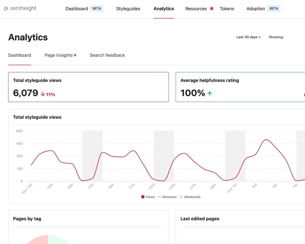
Zeroheight’s analytics and heat maps feature provided valuable insights into how the design system was being used, tracking increased engagement and helping the team identify popular components and documentation sections. By monitoring user interactions, it highlighted areas where the system was thriving and where further improvements were needed. The data also uncovered opportunities for optimization, such as refining underused components or expanding documentation to better meet user needs. This enabled the team to continuously improve the system’s efficiency and effectiveness, ensuring it remained a valuable resource for all stakeholders.
Project year: 2021
Duration: 6 months
Team: Product lead and 2 product designers
A different online form
Journey mapping
Prototyping
Validation / iteration
Design system
The problem
- Poor question set performance
- Negative user feedback: ‘long and complex questions’
- Outdated design & branding
The solution
- Reworked question set journeys validated with users (UX solution)
- Brand new design system (UX/design solution)
- Re-branding (branding and design solution)
Project details
Similar to other brands, Moneysupermarket undergoes regular brand refreshes, which was due in 2020. While the creative and design team work on the brand and visual evolution, my UX team was tasked with tackling the poor question set performance by conceptualizing a different type of question set, and validating this with users using prototypes and customer research.
Initial feedback
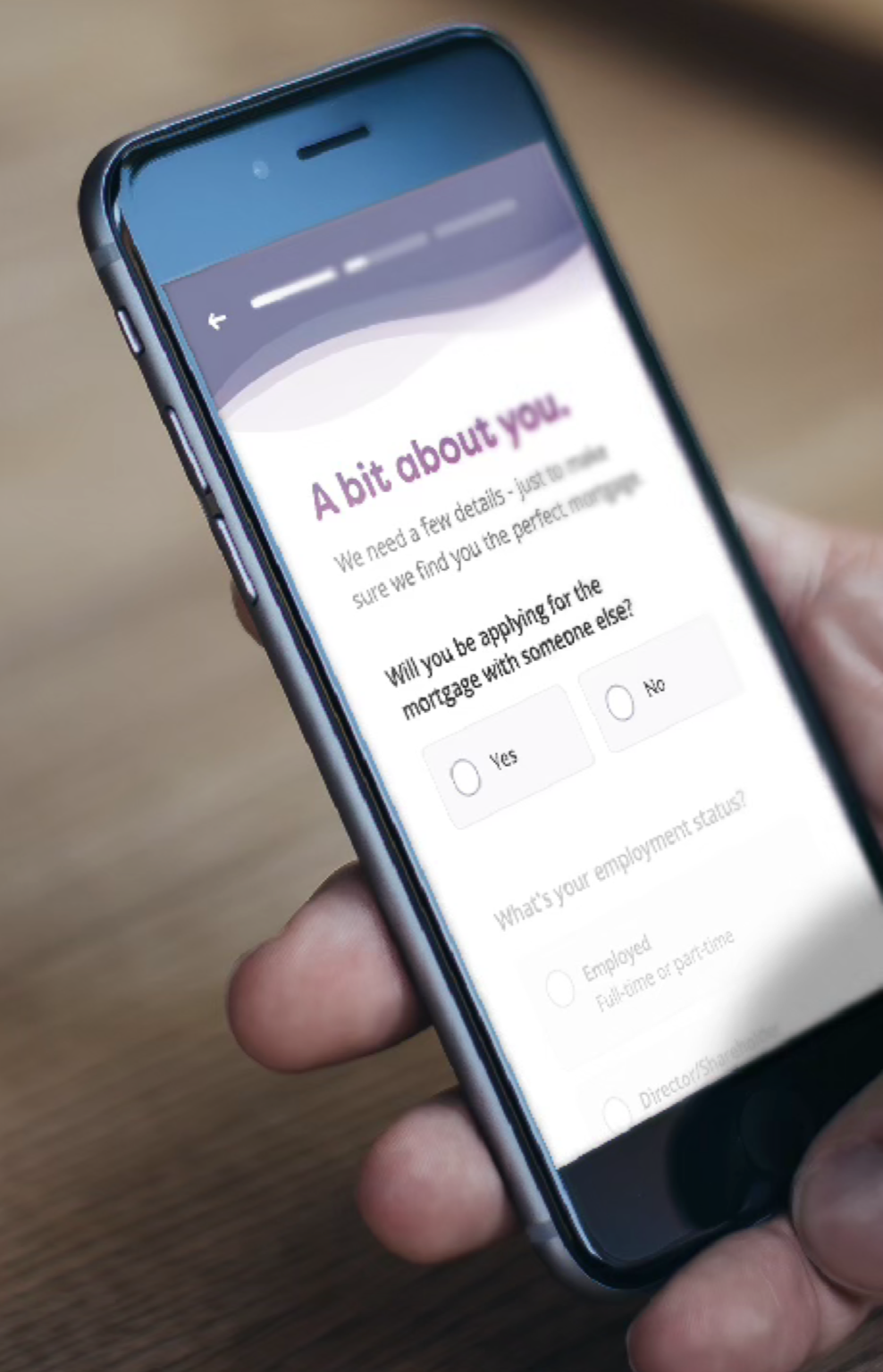
In response to the initial user feedback, after extensive exploration we started experimenting with a new pattern called “gradual form reveal.” This allows users to view the next question only after successfully answering the current one. Previously, users would inadvertently trigger unwanted validations resulted in journey drop-offs due to frustration and missing answers in lengthy forms.
In order to find out if this solutions would solve our initial problems, we created a functional prototype, that simulates the new functionality of the question set on the mobile website.
The functional prototype
This prototype was used to collect feedback and validate the new question set pattern on mobile devices.
The new pattern meant to give a better focus and clarity around sometimes challenging questions to answer.
We did qualitative usability tests with Moneysupermarket’s core customers, who were actively on the market at the time for remortgaging.
The reception was very positive.
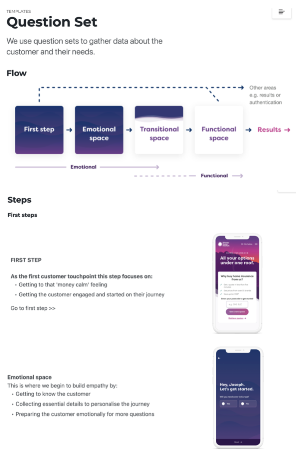
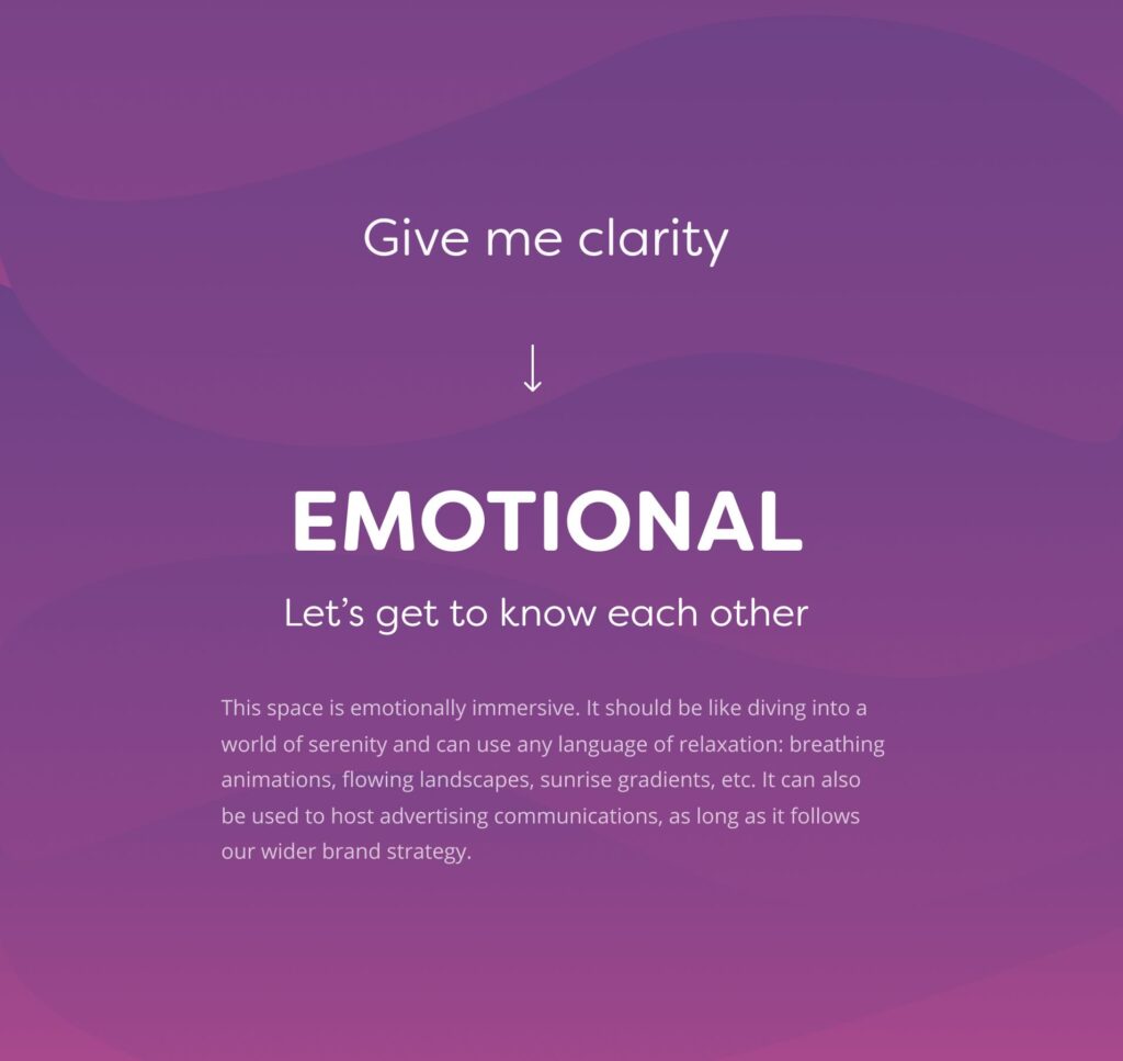
The new pattern
This new pattern resonated well with the test audience in usability testing. Based on the feedback, we iterated the initial concepts and turned them to be used in practice. As a next step, we developed a UX playbook, which served as a comprehensive documentation outlining the new question set pattern, and detail the functionality and behaviors of the improved user journeys. In parallel, UI designers collaborated on redesigning our components, while content designers ensured that our copy aligned with our new tone of voice.
The UX playbook played a crucial role in documenting the user journeys in the next version of the design system.
Project summary
A/B testing these features in quantitative environment on financial products such as mortgages, credit cards, and loans resulted in exceptionally positive outcomes. There were significant uplift on question set conversion rate and consistently less drop-offs across all devices with the new question set compared to the control version.
+10%
Question-set conversion rate
-20%
Question-set drop-off rate
Beyond quantitative metrics, customers reported increased engagement and focus on the necessary field while completing the question set. They specifically highlighted the benefits of the progress bar, indicating their progression in the question set.
Project year: 2020-2021
Duration: 12 months
Team: 5 UX, UI and content designers
A revolutionary life insurance journey
Service design
Prototyping
Validation / iteration
Product optimization
The problem
- Outdated and broken life insurance comparison experience
- Compliance challenges, based on upcoming regulatory standards
The solution
- A new, streamlined comparison and purchase experience on the price comparison website, considering the customer’s health status and personal needs (UX solution)
- Unified question-set for insurers (tech solution)
Project details
In a significant strategic move, the company has embarked on a bold initiative to revolutionize the life insurance comparison market. Their objective was to provide customers with a true price comparison of life insurance policies, based on their health status, personal requirements and needs. Although this may seem evident now, before 2018, this was not the norm and the comparison was tedious and convoluted. Also it failed to comply with upcoming ICOBS and IDD standards.
Phase 1
True comparison & Buy Now proposition
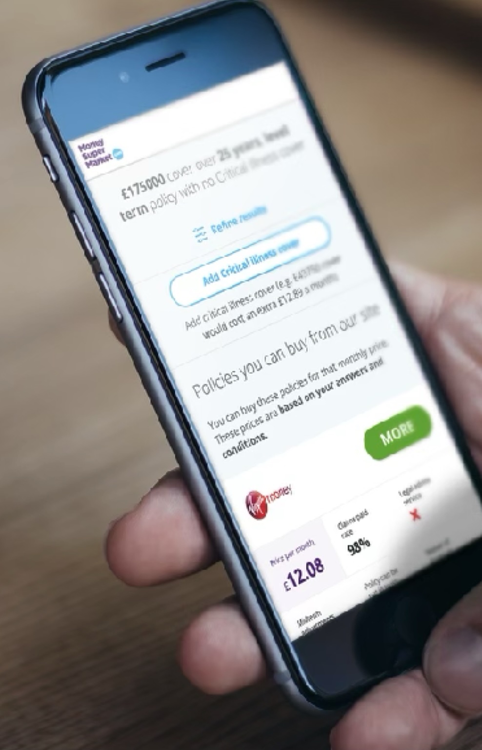
In 2016, individuals had the following options to purchase life insurance: visit a price comparison website or directly get a quote from an insurer.
To obtain the most advantageous deals, users preferred comparison websites like MoneySuperMarket because they could easily compare quotes from various insurers.
The old journey
To get quotes, users answered a few questions about cover amounts, personal details, and smoking habits. This a relatively short form, took only a few minutes to answer.
Then they were presented with a list of quotes. However these prices were not necessarily accurate, because it didn’t take an account the customer’s health and lifestyle.
This provided a false expectation for customers, as they believed they had answered all necessary questions to obtain a quote, and the prices displayed are the actual prices they can purchase the policies.
Unfortunately that wasn’t the case as they needed to continue filling out more questions on the selected insurer’s website.
Step 1
Start a new quote by answering 10-12 basic questions
Step 2
Get initial quotes from insurers with indicative prices
Step 3
Continue on the insurer’s site by selecting a quote
This was quite frustrating for the users. They had spend up to 15-20 minutes answering more, detailed questions about their health history, lifestyle, and further policy requirements.
Also, because this happened on the insurer website, there was a disconnect in the user experience and visual design between the insurer’s website and the comparison site during the quoting process. On occasion, the insurer’s website provided a poorer user experience compared to the comparison site.
If the customer persisted through the additional inquiries, they most likely discovered that their prices had been altered and potentially increased. Also, they had no choice to select an alternative insurer.
Step 4
Answer 30 or more questions about your health and lifestyle
Step 5
Get a real prices and full policy details from the selected insurer only
Step 6
Either purchase the policy or go back to Step 2 and try with another insurer
Multiple problems
This posed multiple problems for the customers, Moneysupermarket and also for the financial regulators:
Customers complained about the long and tedious journeys, and the fact that their prices changed during the comparison.
The business was unhappy with large number of dropoffs and customer trust decrease towards their price comparisons services.
Financial regulators (FCA) were less tolerant with comparisons that won’t show true prices that fully reflect the customer’s needs.
In response to numerous customer feedback, my team helped Moneysupermarket to design, validate and implement a streamlined process, disrupting the life insurance market with a compelling “Buy now” proposition.
The new, streamlined journey
The new journey put more questions upfront for the customers, however at this point they expected to answer a lot of questions, so more dropoffs are expected to be balanced out by better conversion rate when buying the policies.
This assumption seemed to be the case as customers appreciated the real policy prices on the comparison page, as those were based on their health and lifestyle factors.
The new journey was made possible by a new integration technology between unified question sets between insurers.
It also enabled the customers to directly purchase policies from the comparison site, thereby eliminating the cumbersome additional steps and potentially subpar user experience on the insurer’s website.
Step 1
Complete a longer question set upfront, including detailed health and lifestyle questions
Step 2
Get quotes with real prices and full policy details from all insurers based on their answers
Step 3
Select the most suitable policy and purchase it from the price comparison website
Phase 1
Summary
Launching a substantial project like this entails inherent risks mainly to commercial performance and KPIs, such as site conversion rate. Nevertheless, the outcomes were promising and effectively addressed the initial challenges:
Customers who committed to complete the longer question set were able to do a fair comparison and make an informed decision before purchase.
The business was happy with less dropoffs and decreased pressure from regulators. However sales volumes dropped requiring further optimizations.
Financial regulators were pleased with a true comparison for now, but stricter regulations were imminent, meant further requirements for MSM.
In order to tackle decreased sales performance and to comply with future regulations and standards, my team continued to work on the life insurance comparison channel.
Project year: 2018
Duration: 9 months
Design team: 3 product designers
Phase 2
Goal and need based life insurance journey
Introducing the MVP of the Buy Now proposition in 2018, there were still a lot of areas for improvement. The increasing demands from regulators and the potential for enhanced conversion performance presented us with further opportunities to optimize the user journey.
We identified the following areas of improvement in the question set around conversion rate and sales performance:
Number of questions
Every question presents an additional challenge for the user to overcome, thereby posing a risk of an elevated drop-off rate and a decline in the conversion rate.
Relevance of questions
Are all questions relevant? Can we simplify, combine, or remove certain questions to reduce the effort required to complete the question set?
Order of questions
Did we ask questions in the right order, and did we avoid asking similar questions, where the customer could feel they already answered that?
Clarity of questions
Did we communicate clearly and avoid using jargon or commercial language? Did we provide sufficient information to help answer complex questions?
Concurrently, additional areas have been identified for enhanced compliance with forthcoming regulations and standards set forth by the FCA:
Identify customer demands and needs
Did we ask all the right questions to identify the level of cover is needed for our customers?
Results based on customer needs
Did we clearly present results, policy details and cover levels based on our customer’s demands and needs?
Phase 2
Summary
Testing new concepts and optimized question flows resulted a consistent improvement in conversion and sales metrics, while simultaneously enhancing compliance with regulatory standards.
+7%
Conversion rate uplift
-15%
Less questions
-21%
Overall drop-off rate
Project year: 2019-2020
Duration: 6 months
Design team: 2 product designers
The Pingit app redesign
Service design
Prototyping
Mobile app
Interaction / motion design
The problem
- Outdated design & branding on the Pingit mobile app
- Convoluted customer journeys (e.g. onboarding experience)
The solution
- Rebranded app (design solution)
- New interaction principles for the design system
(UX/IxD) - Redesigned user journeys (UX solution)

Project details
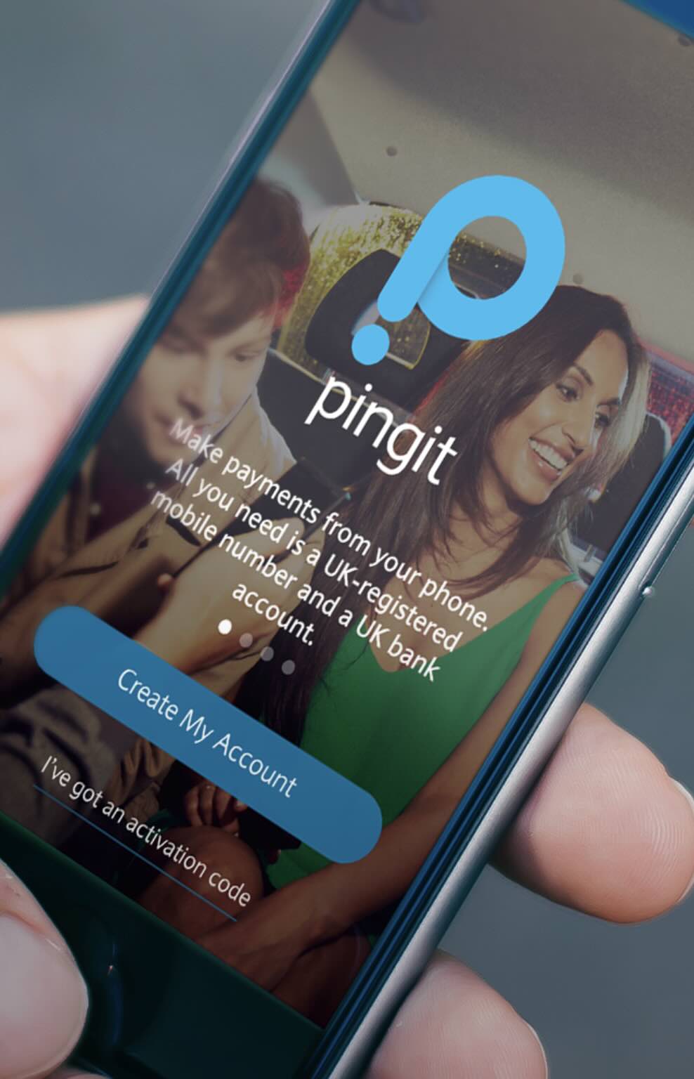
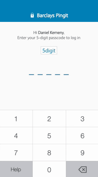
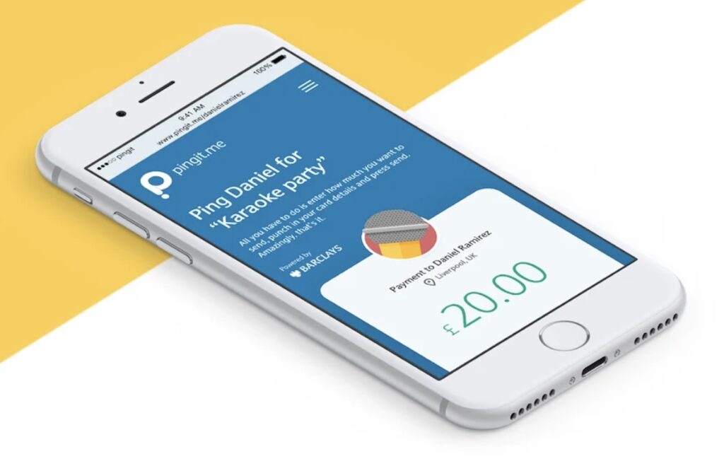
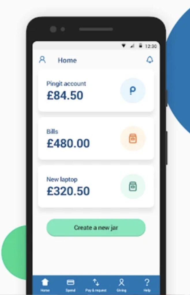
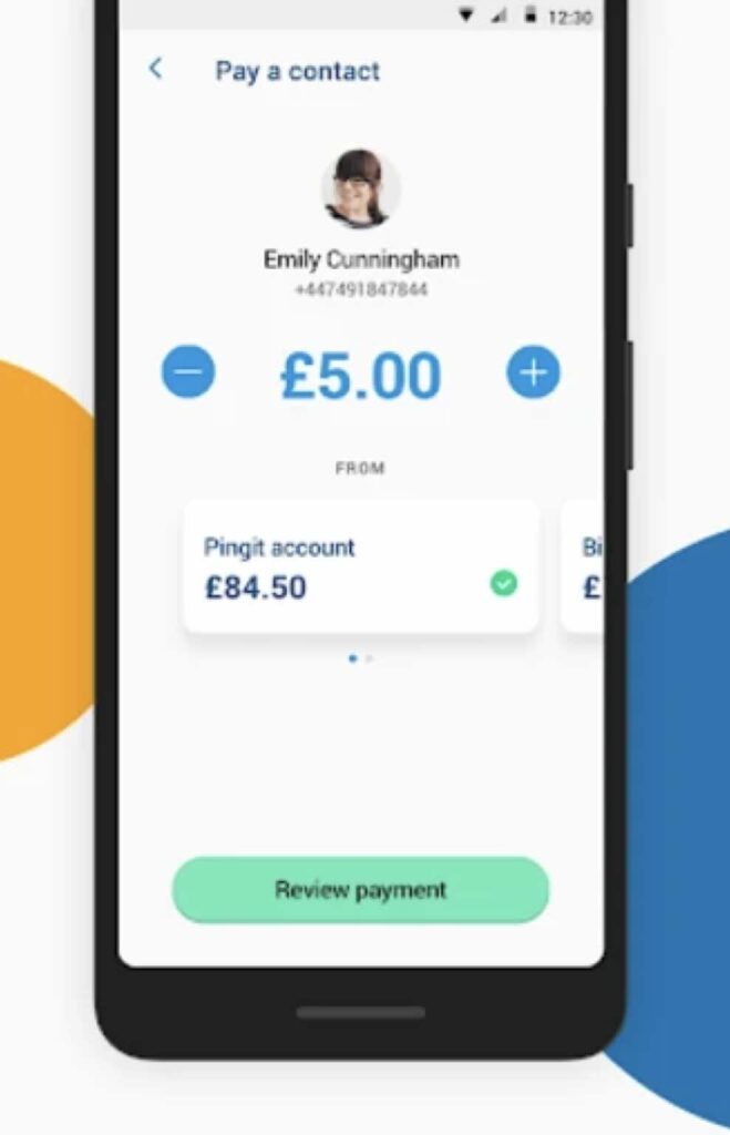
The Barclays Pingit app was a mobile payment solution that allows users to send and receive money instantly, using just a mobile number. It offered a simple and secure way to make payments, split bills, and manage finances, without needing to share bank account details. While it was a standalone app (2015), the design team was involved in redesigning the mobile application to provide better user experience.
Pingit received a major UX overhaul and a brand new visual identity in 2015. I’ve been hired as a UX/interaction designer mainly to help re-designing the UX journeys and the interactions of the app.
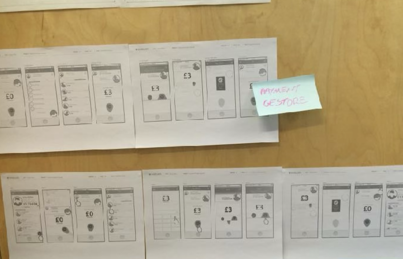
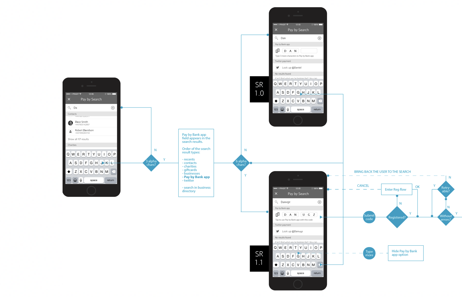
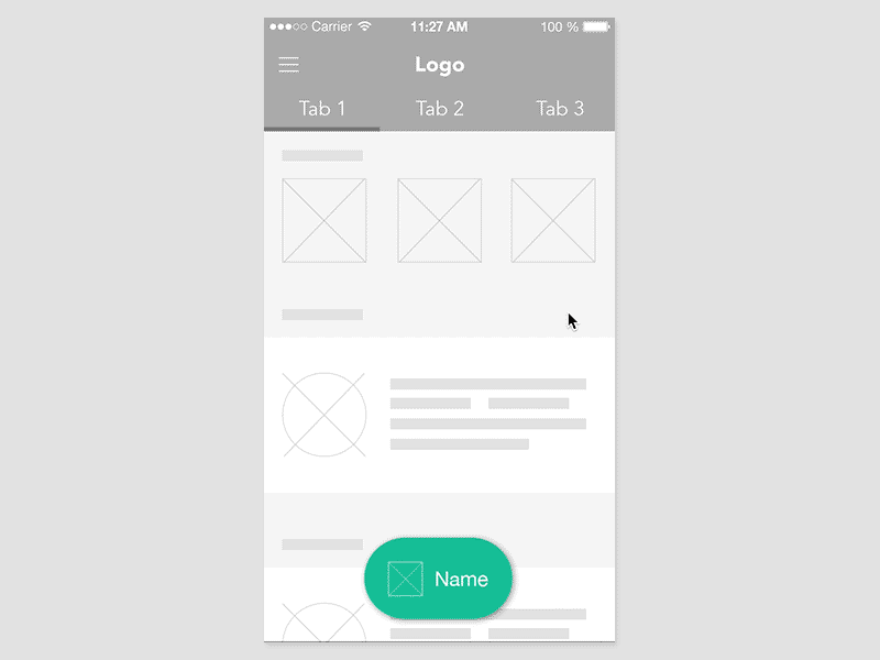
User flows and wireframes
Some of the early flows and wireframes developed during workshops, based on feedback from user research sessions, served as the foundation for navigation concepts and prototypes.
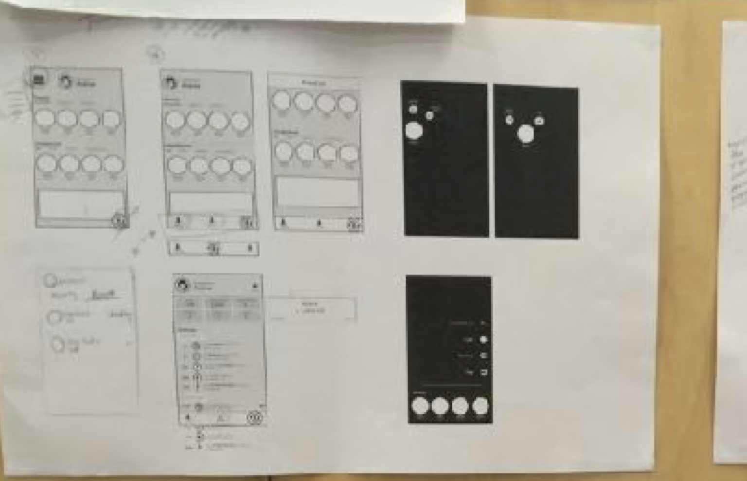

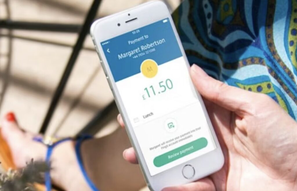
Visual prototypes
Visual prototypes were utilized to evaluate navigation patterns and ascertain the feasibility of meaningful interaction concepts.
Motion design

The newly released application has undergone a visual transformation, featuring a redesigned logo. I have contributed to the motion design concepts for the logo’s animation, which is displayed during the loading process, below the initial storyboard. The animation was crafted using Adobe After Effects.
Motion design prototypes
Here are 2 different version of sound effects we experimented with to be used with the animation.
The following videos contain sound effects
Scope of work
The UX team reworked almost every aspects of the mobile app journey including:
- user onboarding
- main navigation
- main hub page
- payment methods
- payment flows
- accounts view
- app settings
The project was quite complex, because at the same time of the UX overhaul, the app received many additional functions on top of the brand new look & feel.
(Android app)
(Android app)
(Android app)
Project summary
The revamped user interface, redesigned customer journeys, and enhanced interactions provided a rejuvenated experience for the Pingit application. The app received further features in the following years. Later in 2021, Pingit and its features were subsequently merged with the Barclays mobile app.
Project year: 2015-2016
Duration: 9 months
Design team: 6 designers
Coming soon…
Design system
Service design
IA
Product strategy
Product optimization